
Building a brand that's as hardworking, straightforward, and memorable as the man behind it.
01 / The Brand Story
Shift Happens is a locally owned mobile automotive repair business serving Idaho's Treasure Valley and surrounding communities. Founded by Josh, the business brings professional automotive diagnostics, maintenance, and repairs directly to customers, eliminating the hassle of traditional shop visits.
With a business name that's impossible to forget and a founder who believes in honest work and straight answers, Shift Happens needed a brand identity that reflected its personality without sacrificing professionalism.
The vision was simple: create a recognizable, trustworthy business that feels approachable, capable, and just a little irreverent.

02 / The Creative Direction
Unlike a traditional automotive brand built around generic tools and predictable industry imagery, Shift Happens needed a visual identity with its own character.
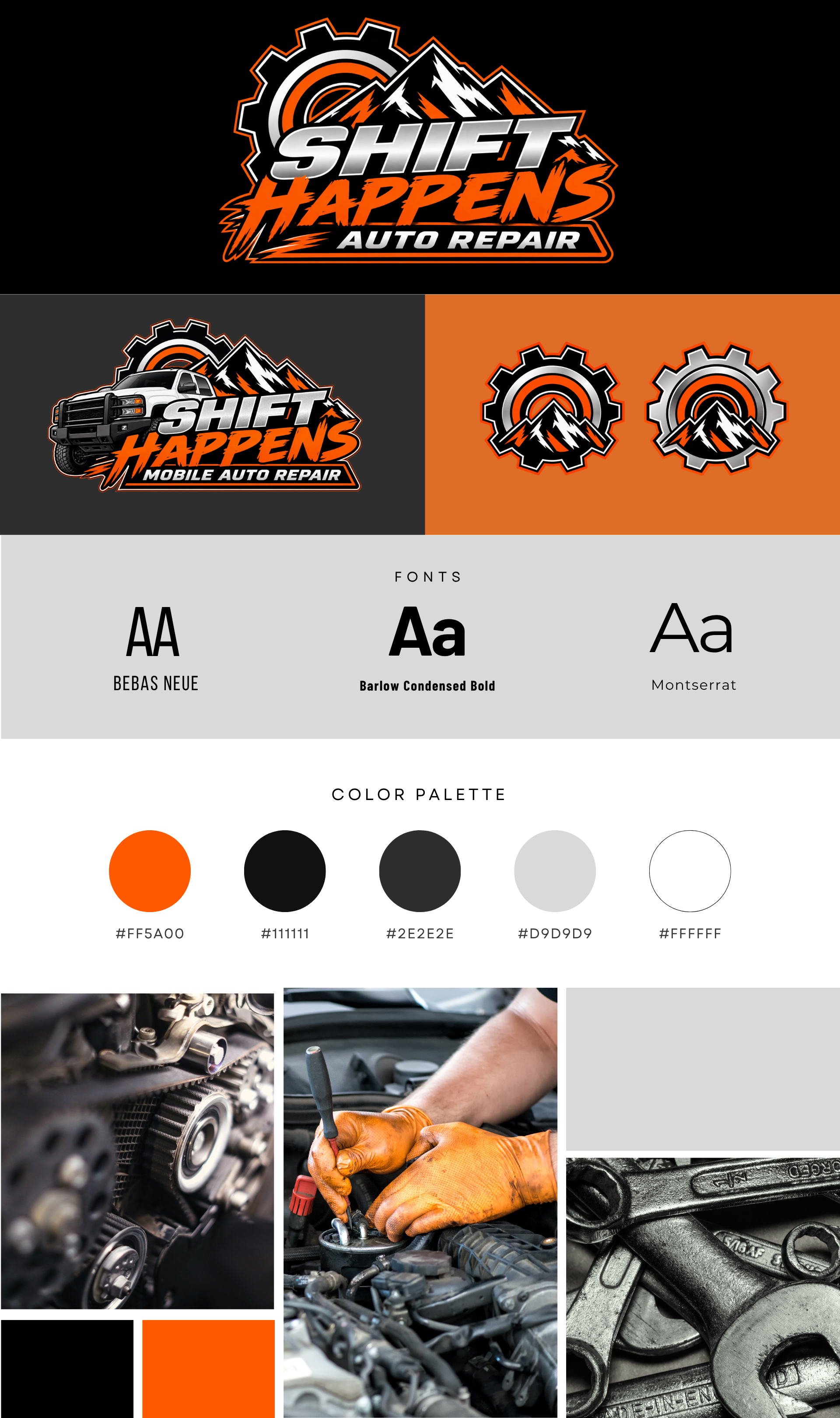
The creative direction embraced bold typography, industrial-inspired design, and a high-contrast color palette. Vibrant orange became the signature color, complemented by black, charcoal, silver, and white.
The result is a visual style that's rugged, confident, and easy to recognize, with just enough humor to make the brand memorable.
The goal was to strike a balance between personality and credibility. Customers should appreciate the clever name, but immediately understand that there's a skilled professional behind the business.
03 / The Brand Identity
The Shift Happens brand identity was designed to translate across both digital and physical marketing, maintaining consistency wherever customers encounter the business.
Its bold visual system combines industrial-style typography, striking orange accents, dark neutral colors, and adaptable logo variations.
Signature Palette: Shift Orange · Asphalt Black · Garage Charcoal · Steel Silver · Clean White
Brand Personality: Straightforward · Capable · Dependable · Approachable · Witty
Brand Message: When Shift Happens, We Show Up.
Together, these elements create an identity that feels authentic to the business and distinct from conventional automotive repair branding.
04 / Bringing It to Life
The creative development of Shift Happens extends beyond its logo into the ways the business introduces itself, communicates with customers, and establishes a presence in the local market.
The brand direction supports its website, social media presence, business cards, promotional materials, and other customer-facing communications.
Throughout the project, the focus has been on making the business easy to recognize and understand. Customers need to know what Shift Happens offers, where it operates, and why mobile automotive repair can be a convenient alternative to visiting a traditional shop.
Just as importantly, the messaging reflects Josh's personality: professional without being overly formal, confident without being complicated, and funny without losing credibility.
05 / The Final Edit
Shift Happens demonstrates how strategic branding can give a service-based business a distinctive personality in a competitive industry.
By combining bold design with practical messaging, the brand creates a recognizable identity that communicates both its services and the person behind them.
It's proof that a professional brand doesn't have to be overly polished, corporate, or predictable to make a strong impression.
Sometimes, the best branding is the kind that knows exactly who it is—and isn't afraid to have a little fun along the way.